Blog layouts through the ages
Welcome to adulthood, chaosworks.org! This domain name has now been in my possession for 18 years, and this year, in 2023, it has finally found a new purpose after having been a mere splash screen for over a decade.
If you’ve followed my internet presence in the past, you probably know that I’ve always had some sort of website or blog. I have already mentioned some of these in my post Delving into the past of this blog from a few months ago.
Now with chaosworks.org as the latest incarnation of my personal internet presence, as well as with a new look, I think it’s time to reminisce a bit more about the past, present and future of blogs and personal websites – and there’s no better time than now, with internet movements such as Yesterweb and The Web Is Fucked gaining popularity.
Creating personal websites and blogs, starting in around the year 2000, was how I learned coding. My first couple of websites were still made with some sort of WYSIWYG editor, the name of which I forgot1 But pretty soon I learned more about the ways of making websites, and started to learn HTML, CSS, and eventually also PHP and MySQL. My first blog was completely self coded, with the help of tutorials written by, among others, the amazing Jem.
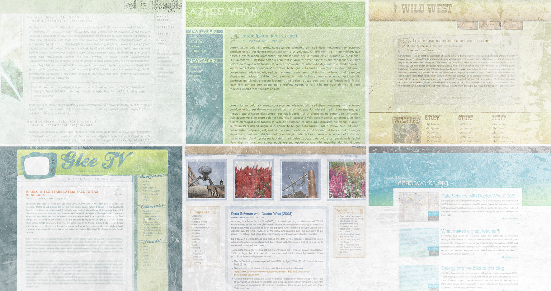
And with that, let’s showcase one of the many layouts that self-coded blog had in around 2005:
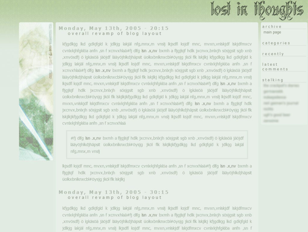
Obviously I hadn’t heard of Lorem Ipsum back when I made this mock-up. But look at it, it’s a perfect incarnation of 00’s blog layouts with it’s tiny text and right-alignment. One could say it was even fairly modern for its time, with its rounded corners!
Grunge was a big thing in 00’s blog layouts, and many of my layouts back then were in a similar vein. At some point, my creativity ran a bit free with me, and I started making layouts that were very thematic. One such example is my “Aztec Year”2 layout, which I really enjoyed a lot for its colors, and it’s clean structure, while still having a bit of a grungy look:
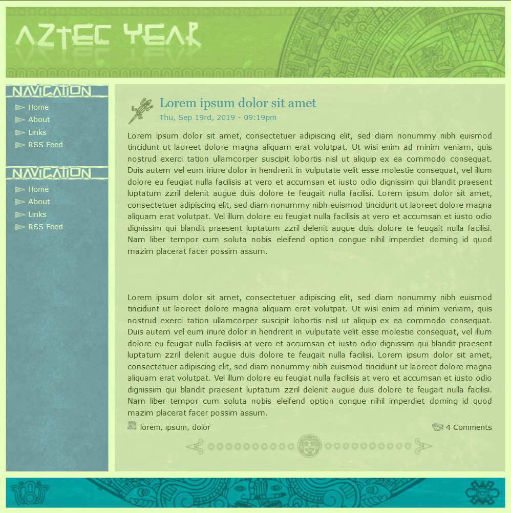
The little creature next to the post title changed according the category of the post, just to make it a bit more interesting and dynamic.
In a similar, slightly grungy vein, I would like to present one of my proudest achievements in web design to date, my “Wild West” layout:
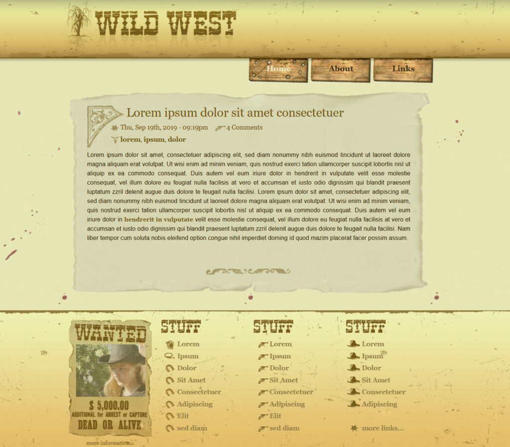
It had a really cool hover effect on the navigation, with bullet holes appearing when you hovered over an item. Also, the “Wanted” posted at the bottom was automatically updated with my latest picture from dailyfratze.de3
A layout that used a similar idea was my 50’s style “glee.tv”4, where the TV at the top was always automatically updated with my latest picture:
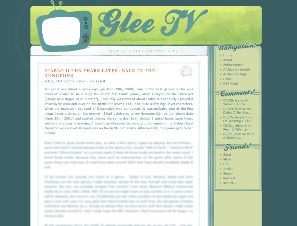
Similar to my Aztec layout, the little image to the right of to the title changed according to which category the post was categorized as, which I thought was very cool back then.
I don’t quite remember if glee.tv was still using my self-made PHP blog script, or whether I switched to WordPress back then already. But I definitely remember that my “Egyptian” layout used WordPress, and was another theme that I was very proud of at the time:

Again I added fun little details to the layouts. Here the images in the header changed according to which type of site you were on, showing a different selection of pictures for each category or site type. The pictures were from my personal (travel) gallery, which now resides at palinopsia.net.
And technically this WordPress theme still works! I reactivated it to take this screenshot, but it hasn’t been in use for at least a decade. One of the reasons for that is that, obviously, all the layouts I have presented here so far, were completely static. But with the rise of smartphones, the web changed dramatically, and sooner or later everything had to be responsive. That’s honestly also when I lost interest in blogging (in addition to other reasons mentioned here). Personally, for me, coding responsive websites took away a lot of fun and a lot of creativity. I was also busy with other things in my life, so my next, and probably longest-lived theme, became a modification of an existing WordPress theme that looked like this:

It was based on the theme freak (probably a much earlier version than what is linked), and I modified it very heavily, changing colors, fonts, and adding the text effect for posts that do not have a featured image. It’s fully responsive, and still fully functional as a WordPress / ClassicPress theme.
And with this, we have reached the present! I do not have the energy of my 20ish year old self anymore to code themes from scratch, which is why I looked for a theme that roughly fits my requirements, and again I more or less heavily modified it to my liking. In this case, it’s the theme Minimalist Blog, which I daresay I made even more minimalist. The good thing is that it’s responsive and works on any platform, something that I would really not have liked to code myself these days. Having been out of the web dev business for over 10 years would mean a lot of catching up, and I’d rather invest my coding energy into R and Python these days. Nevertheless, I enjoyed dabbling around this theme in PHP and CSS again.
I hope you enjoyed this little journey into the past. I would like to point out that these were just a very small selection of layouts my personal internet presence had in the past. I believe in total, there were somewhere between 30 and 50 layouts, most of which are unfortunately lost in cyberspace. Maybe that’s for the best 🙂

Write a response